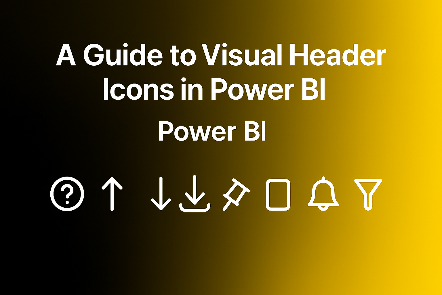
Visual headers in Power BI are designed to make interacting with reports easier and more powerful. When you hover over a visual, a set of small icons appears—these visual header tools let you explore, filter, and interact with your data in meaningful ways.
This guide will help you understand what each icon does and how to use it to navigate and get the most out of the reports you view.
A) Visual Header — Icons
Before diving in, take a moment to look at the icons shown below. These visual header icons appear when you hover over a visual in a Power BI report, giving you quick access to features that make it easier to explore and understand the data.
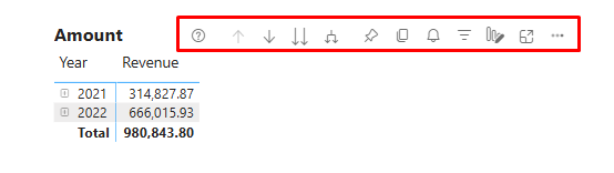
B) Quick Overview of Power BI Icons
Here’s a simple summary of the icons you might see when you hover over a visual in Power BI. This table shows what each icon does and helps you understand how these tools can enhance your report-viewing experience.
C) Power BI Visual Header Icons – What They Mean for You
| Toggle | What It Does (For You) | Icon Preview | Considerations |
| Visual Info | Tells you if there’s something you should be aware of in the visual. | Indicates an informational note; doesn’t affect visual behaviour. | |
| Visual Warning | Shows a warning if the visual might be incomplete or needs attention. | May appear due to missing data or configuration issues. | |
| Visual Error | Appears if something’s gone wrong with the visual. | Usually caused by broken measures, incorrect filters, or unsupported visuals. | |
| Drill on dropdown | Choose whether to drill down by rows or columns in a matrix. | Available only for Matrix visuals with hierarchical data in both rows and columns. | |
| Drill Up | Move up one level in a hierarchy (e.g., from Month to Year). | Requires hierarchical data. | |
| Drill Down | Go one step deeper in the data (e.g., from Year to Quarter). | Requires hierarchical data. Click the icon to enable drill mode. | |
| Show Next Level | Jump straight to the next level of data. | Requires hierarchical data. | |
| Expand to Next Level | Show current level and next level of detail at once. | Requires hierarchical data. | |
| Pin | Add the visual to your dashboard for quick access. | Available only in Power BI Service. | |
| Focus Mode | Enlarge the visual to view it in detail. | Useful for complex visuals. Restores to original size on exit. | |
| See Data Layout | Let’s you view the layout of the data table. | NA | May be disabled depending on report permissions or visual type. |
| More Options | Opens a menu with more actions like sorting or exporting. | Available on most visuals. Content may vary based on permissions. | |
| Filter | Shows filters and slicers affecting the visual. | Reflects filters applied from slicers, pages, or visuals. | |
| Help Tooltip | Displays helpful info or explanations set by the report creator. |  | Configured by report authors. Appears as a hover tooltip icon. |
| Comment | Let’s you leave or view comments on the visual. | Available only if comments are enabled in the report settings. Disappears if disabled. | |
| Personalize Visual | Make changes to the visual (like switching the chart type). | Disappears if personalization is disabled in report settings. | |
| Copy as Image | Copies the visual as an image so you can paste it elsewhere. | Disabled for unsupported visuals like R etc. May be disabled by admin settings. | |
| Add Alert | Set threshold-based notifications. | Available only in Power BI Service. |
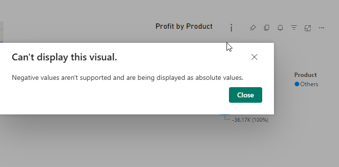
1. Visual information icon
The Visual Information icon appears when there’s something important you should know about a visual. It doesn’t always indicate an error—it’s Power BI’s way of giving you a heads-up.
Here’s what it might mean when you see it:
- Map Visual: Some location data may be missing or invalid (e.g., incorrect latitude/longitude), or there may not be enough data to render a filled map.
- Line Chart (or other visuals): The visual may not display all data points if there’s too much information to show clearly.
When you see this icon, hover over it to read a short message explaining what’s going on.
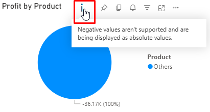
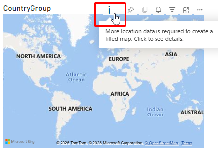
Hover over the icon to view the information text or error message, and click it to see details that can help you resolve the issue.
2. Drill Icons
Drill icons in Power BI let you explore data hierarchies step by step—starting from a broad overview and drilling into finer details. They appear only when a visual contains a hierarchical field (for example, Year → Quarter → Month → Day), and they help you navigate levels of data without leaving the page.
Here are the six main drill icons you’ll see in the visual header:
- Drill Up – Return to the higher level of the hierarchy
- Drill Down – Dive into the next level of detail
- Show Next Level – Jump directly to the next layer of the hierarchy
- Expand All Down One Level – Display multiple levels at once
- Drill Mode Toggle – Enable interactive drilling by clicking within the chart
- Drill on Dropdown (Rows/Columns) – Choose to drill on Rows, Columns, or both (Matrix visuals only)
These icons are available in any visual that uses a valid hierarchy.
When applied to a stacked column chart showing Amount by Date Hierarchy (Year → Quarter → Month → Day), the icons look like this:
 |
2.1 Drill down Icon:
Drill Down allows you to explore more detailed levels within a visual’s hierarchy. When Drill Mode is turned on, clicking a data point will drill into that specific category—showing the next level of detail within the same visual, without affecting other visuals on the page.
Clicking the Drill Mode icon again will turn it off, allowing normal interactions without resetting the visual.
 |
 |
2.2 Drill up Icon:
Drill Up takes you one level higher in the hierarchy. If the icon is greyed out, you’re already at the top level.
 |
2.3 Drill on dropdown:
Drill on Dropdown lets you control whether drill actions target the row or column hierarchy in a Matrix visual. It appears when both rows and columns contain hierarchical fields. When you select an option from the dropdown, the Matrix adjusts its drill behaviour accordingly. This helps you focus your analysis on the specific dimension you want to explore. The setting stays active until you change it or switch visuals.
Notes: The Drill on Dropdown feature is only available in the Matrix visual
 |
How to Use Drill on Dropdown for Row-Level Drilling:
- Select the Matrix visual in your report.
- Click the “Drill on” dropdown in the top-right corner.
- Choose “Rows” from the dropdown menu.
- Then, click on any row in the Matrix — it will drill into the next level of that row’s hierarchy.
 |
How to Use Drill on Dropdown for Column-Level Drilling:
- Select the Matrix visual in your report.
- Click the “Drill on” dropdown in the top-right corner.
- Choose “Columns” from the dropdown menu.
- Then, click on any column header — it will drill into the next level of that column’s hierarchy.
2.4. Show next level Icon:
Show Next Level moves the entire visual down one level in the hierarchy—for example, from Year to Quarter, then to Month, and finally to Day. If the icon appears greyed out, you’re either already at the lowest level or the visual can’t show the next level for all data at once.
Once you’ve drilled down, selecting Drill Up will take you one level back up in the hierarchy.
 |
 |
 |
 |
2.5. Expand to next level Icon:
Expand to Next Level adds the next level of detail below the current view in the hierarchy—showing both levels together. For example, if you’re viewing Year, using this icon will show Year + Quarter, then Year + Quarter + Month, and so on.
If the icon is greyed out, you’re already at the lowest level, or not all data can be expanded further.
After expanding, you can use Drill Up to remove the most detailed level and go back one step in the hierarchy view.
What Happens in each click:
- First Click: Shows Year and Quarter together.
- Second Click: Adds Month under Quarter.
- Third Click: Adds Day, if available.
- Icon Greyed Out: You’re at the lowest level or data doesn’t support further expansion.
2.6. Supported visuals types for drill features:
- Bar charts
- Column charts
- Line charts
- Area charts
- Pie/Donut charts
- Treemaps
- Matrix
Note: The visual must have a hierarchy field added to the Axis like this (e.g., Date → Year → Quarter → Month → Day).
 |
 |
3. Focus Mode Icon:
Focus Mode helps you enlarge a single visual so you can see it more clearly without distractions from the rest of the report. It’s perfect when a page feels crowded or you want to explore one chart in full detail.
While in Focus Mode, you can:
- Interact with the visual just like in normal view (hover, filter, drill).
- Use toolbar options (like exporting data or drilling down) if enabled.
- Return to the full report view by clicking the Back to Report button.
Note: Focus Mode isn’t available for some visuals like cards and Q&A, where zooming doesn’t add value.
Use Focus Mode anytime you want to stay focused on one visual without losing functionality.
 |
4. Pin Icon:
The Pin icon lets you save a visual to a dashboard so you can quickly view key insights without opening the full report.
When you click the Pin icon:
- Choose an existing dashboard or create a new one.
- Decide whether to:
- Keep the visual’s original theme, or
- Apply the dashboard’s theme (if it has one).
Note: Pinned visuals are static (they don’t support interaction like filtering), but they stay updated with the latest data.
 |
5. Filter Icon:
The Filter icon on a visual shows you which filters or slicers are currently applied. This helps you understand why the data looks the way it does.
When you click the icon, you’ll see a list of:
- Slicers used on the page
- Filters applied at the visual, page, or report level
This makes it easy to track what’s influencing your results without opening the filter pane.
 |
6. Copy Icon:
The Copy icon lets you copy a visual as a static image so you can easily paste it into emails, documents, or chats.
How to Use It:
- Click the Copy icon on the visual.
- Power BI will process the image—it may take a few seconds.
- Follow the on-screen instructions.
- Once ready, paste the image into your desired app (like Outlook, Word, or Teams).
The copied image includes helpful info:
- A clickable link back to the Power BI report
- The report title
- A notice if the image contains confidential data
- Timestamp of when the visual was last refreshed
- A summary of filters applied to the visual
Note: This feature isn’t available for all visuals. If the icon is greyed out, it means the visual (like Maps, Python, or R visuals) can’t be copied.
Use this feature to quickly share insights with others while keeping important context intact.
 |
7. Help tooltip Icon:
The help tooltip icon gives you extra support or guidance for a visual—just hover over the icon to view the information.
Unlike regular tooltips that show up when you hover over data points, this one always shows helpful content, even if no data is selected.
What You Might See:
- A short text explanation.
- A mini report page showing calculations, notes, or extra visuals.
 |
 |
8. Personalize visual Icon:
The Personalize visual icon lets you explore and adjust visuals in a report—even if you don’t have edit permissions or access to Power BI Desktop.
When you click the icon, a personalization pane opens, allowing you to:
- Change the visual type (e.g., switch a bar chart to a pie chart)
- Swap or replace fields like measures or dimensions
- Add or remove legends
- Compare multiple measures in the same chart
- Change aggregations, like switching from “Sum” to “Average”
 |
Once you make changes, a Reset icon appears—clicks it anytime to undo your changes and go back to the original visual saved by the report author.
You can also save and share your personalized views for later use or to collaborate with others.
Tip: This feature helps you explore the data in your own way without affecting others’ view of the report.
 |
9. Smart narrative Icon:
The Smart Narrative icon helps you understand complex visuals by generating automatic text summaries of the data shown in a visual or report page. It turns numbers into plain language insights, making it easier for you to quickly grasp trends, comparisons, and key metrics—without needing to analyse each chart manually.
How to Use It:
- Click the Smart Narrative icon from the visual header (if enabled).
- A text box appears, summarizing the visual’s data—like top values, growth, or changes over time.
- You can interact with this summary or add more custom text to explain your findings further.
What you’ll Gain:
- Instant, readable summaries of visuals.
- Auto-generated insights like “Revenue increased by 20% in 2022”.
- Support for natural language explanations, especially useful in dashboards with multiple visuals.
 |
10. Add Alert Icon:
The Alert icon allows you, as a report viewer, to set up notifications when the value of a visual crosses a defined threshold—like when revenue drop below a target or inventory runs low. This helps you track important KPIs without needing to monitor the report every day.
What It Does:
- Sends you an email and in-app notification when a value goes above or below your chosen limit.
- Each alert is personal—only you can manage your own alerts.
How End Users Can Use the Alert Icon:
Here’s a quick step-by-step guide to setting up an alert in the Power BI Service:
- Go to your Dashboard in Power BI Service.
- Hover over a tile (Card, KPI, or Gauge visual, etc.)
- Click on the Alert icon in the top-right corner of the visual or tile.
- In the alert setup pane:
- Name your alert (optional).
- Set the condition (e.g., “Above 10,000” or “Below 5 %”).
- Choose how to receive alerts: email, Power BI notification, or both.
- Click Save and close.
Power BI will now check your data regularly and notify you when the condition is met.
Note: Fabric capacity is now mandatory to enable alerts in any workspace (even Pro).If you’re in a Pro Workspace without Fabric, you’ll see the message:
“You have no workspaces with Fabric licenses to create an alert.”
  |
11. More Options Icon:
The More options icon, found in the top-right corner of visuals, gives you quick access to several helpful actions you can take on the visual. These include options like:
- Export data
- Show as a table
- Spotlight
- Share
- Add alert
- Add a comment
- Explore this data (preview)
- Get Insights
- Sort Axis
This icon acts as a one-stop menu to explore, analyse, or export data directly from the visual.
11.1 Add a Comment:
The Comment feature lets you add feedback; ask questions, or @mention colleagues directly on a report, dashboard, or specific visual.
How to Use It:
- Hover over a visual or open a report/dashboard.
- Click the Comment icon (a speech bubble).
- Type your message—up to 2,000 characters.
- Use @mentions to notify specific colleagues.
- Hit Post. Your comment is saved along with the current filters and slicers, so context is preserved.
 |
This threaded conversation feature is great for:
- Discussing insights or anomalies.
- Tagging teammates for clarity.
- Keeping track of why certain filters or visuals were used.
 |
Note: This feature requires Power BI Pro license.
11.2 Export Data:
The Export Data feature lets you download the data behind a visual so you can analyse it further in Excel or as a CSV file outside Power BI.
How to Use:
- Hover over a visual and click on the more options (⋯) menu.
- Select Export data.
- Choose the export format:
- Summarized data – See aggregated numbers used in the visual.
- Data with current layout – Exports the visual as seen (only for tables and matrices).
- Underlying data – See the raw data used to create the visual (available only if enabled by the report author).
- Click Export – the data will download as an Excel (.xlsx) or CSV (.csv) file based on your organization’s settings.

11.3 Show as table:
The Show as a table option lets you view the underlying data in a simple table format, right next to or below the visual. It’s a great way to see the exact numbers behind what you’re looking at in the chart or graph—without leaving the report.
How to Use:
- Hover over any visual and click on the more options (⋯) icon.
- Select “Show as a table.”
- Power BI will display a data table either below or beside the visual, depending on your screen size.

 |
Notes:
- This option acts like a mix between Focus Mode and Export with Current Layout.
- It is read-only—you can view but not edit.
- Not available for some visuals, like:
- Cards
- Q&A visuals
- Key Influencers
- Decomposition tree
If the option is missing, it might be due to the visual type or report settings.
11.4 Spotlight:
The Spotlight feature lets you bring extra attention to one visual by dimming all the others on the report page. It’s perfect when you want to focus on a specific chart or graph without distractions from surrounding visuals.
How to Use:
- Hover over a visual and click the more options (⋯) icon.
- Choose “Spotlight”.
- That visual will stay bright and clear, while the rest of the visuals on the page will fade out slightly.
 |
11.5 Get Insights:
The Get Insights feature helps you, as an end user, quickly uncover important patterns—like spikes, dips, trends, or comparisons—in your report visuals, without having to manually explore them.
How to Use It
- Open a report that supports insights.
- Click the Get Insights (light bulb) icon in the top action bar—or use more options (…) on visual and select Get insights.
- A pane appears with auto-generated insights for that visual or the current page.
- Click on any insight (e.g., Anomalies, Trends, KPI Analysis) to view additional context and details.
Use this to uncover hidden insights quickly and make smarter data-driven decisions—no analysis skills needed!
11.6 Explore this data (preview):
Explore this data is a preview feature in Power BI that lets end users interactively explore the data behind a visual—without needing editing access or technical knowledge.
It acts as a lightweight, guided data exploration tool, giving you an Excel-like experience within Power BI.
What You Can Do With It
- View the underlying data for a specific visual.
- Sort, filter, and group data.
- Create simple visual summaries like bar charts, KPIs, and tables.
- Perform basic calculations (e.g., sum, average, count) on fields.
- Customize the layout by dragging and dropping fields.
How to Use It:
- Click the More Options (⋯) icon on a visual.
- Select Explore this data (preview).
- A panel opens showing a table of the data.
- Customize by dragging fields into rows, columns, or values.
- Apply filters or simple aggregations as needed.
After you’re done, results can be saved to a workspace or used in your analysis.
 |
11.7 Share:
Power BI allows you to share insights directly from a visual using three handy options under the Share button. These make collaboration and communication easier, whether you’re working in Teams, preparing a presentation, or just want to highlight a specific insight.
 |
11.8 Link to this visual:
Link to this visual lets you share a direct link to a specific visual, including any applied filters or slicers. Just click more options (⋯) → Share → Link to this visual, copy the link, and send it to colleagues for quick and focused collaboration.

11.9 Chat in Teams:
Chat in Teams allows you to share a visual directly in Microsoft Teams. Just go to Share → Chat in Teams, select the person or channel, add a message, and send. It embeds a clickable thumbnail of the visual in the chat, making collaboration easy and contextual.

11.10 Open in PowerPoint:
Open in PowerPoint allows you to export your Power BI report into a PowerPoint presentation. Go to Share → Open in PowerPoint. The export includes a clickable link that redirects to the report in the Power BI Service. This is useful for presenting insights while keeping the report interactive and up to date through the live connection.
11.11 Sort Axis:
Sort lets you change the order of data in a visual to better understand trends or comparisons.
To use it:
- Click the Sort icon (or use the column header in some visuals).
- Choose the field you want to sort by (e.g., Year, Sales).
- Select either ascending or descending order.
Sort options automatically adjust based on the visual type and the data being used—so you’ll only see relevant choices. This helps you quickly find the insights that matter most.