Employee productivity is one of the most important drivers of operational efficiency, but it is also one of the least accurately measured. Many organizations continue to assess productivity using surface-level indicators such as headcount, hours worked, and total jobs processed. While these metrics provide basic visibility, they do not explain how employee efforts translate into operational output, financial performance, or long-term viability.
As operations expand, this lack of clarity creates risks: some teams become overloaded while others remain underutilized, costs rise inexplicably, and service quality suffers. A BI dashboard tackles these issues by linking workforce activity with workload and financial outcomes in a single view, enabling leaders to plan, optimize, and scale operations proactively.
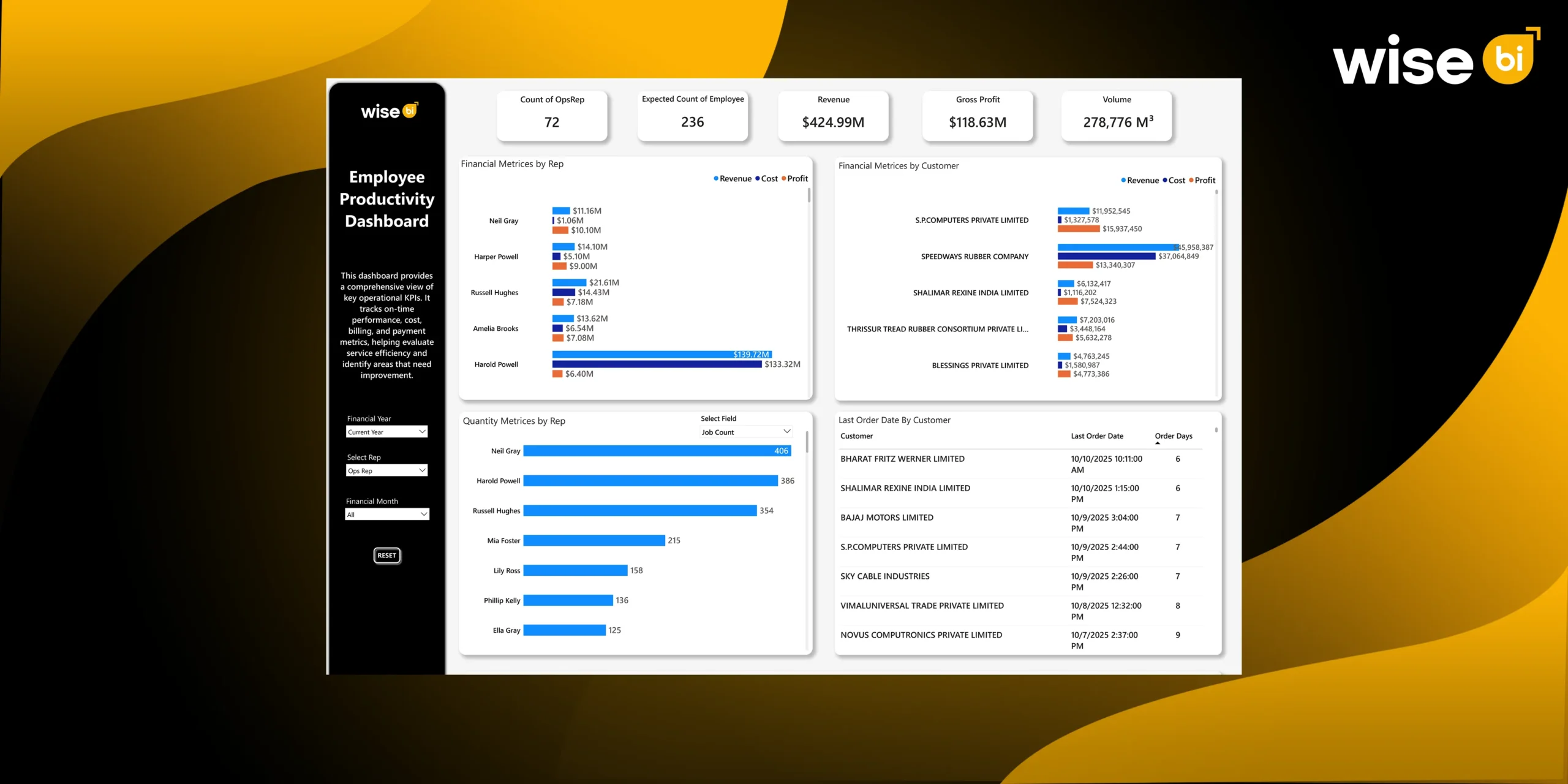
Employee Productivity Dashboard
An employee productivity dashboard is a visual reporting tool that consolidates employee performance, activity, and output data into one clear, easy-to-understand interface. It helps organizations see how work is getting done, where time is being spent, and how effectively teams are performing, all in real time or near real time.
Instead of relying on spreadsheets, manual reports, or assumptions, leaders and managers use this BI dashboard to gain a fact-based view of workforce productivity across individuals, teams, departments, or the entire organization.
What does an Employee Productivity Dashboard Measure Beyond Headcount?
Headcount Alone Does Not Reflect True Productivity
Headcount indicates how many people you have, not how efficiently work is completed. Teams with the same staffing levels can achieve vastly different outcomes depending on workload balance, task complexity, and process efficiency. Relying solely on headcount often leads to inaccurate conclusions about performance and staffing requirements.
Understanding Actual Workload per Employee
An employee productivity dashboard shows what each employee is actually handling, such as job count, shipment volume, service mix, and operational complexity. Organizations get a clear, accurate picture of work distribution when they measure actual workload rather than assumed effort.
Job Count, Volume, and Effort Normalization
Not every job requires the same amount of effort. Productivity dashboards normalize workload to account for differences in volume, service type, and operational complexity, allowing for fair comparisons of performance across employees and teams.
Actual Productivity vs Expected Capacity
A key function of this BI dashboard is to compare actual output to expected capacity based on historical performance, process benchmarks, and workload estimates. This identifies productivity gaps and highlights areas where performance deviates from realistic expectations.
Early Signals of Underutilization and Overload
Routine productivity tracking identifies early signs of idle capacity or employee overload. Managers can proactively rebalance workloads, avoiding cost leakage, burnout, and service disruption.
How does Employee Productivity Impact Revenue, Cost, and Profit?
Linking Operational Effort to Financial Outcomes
Without a financial context, it is impossible to assess true productivity. By directly linking employee activity to revenue generation and cost consumption, an employee productivity dashboard guarantees that productivity conversations are based on business results.
Revenue per Employee vs Profit per Employee
Although it can be deceptive, revenue per employee is frequently used as a productivity metric. Profitability is not always correlated with high revenue. The BI dashboard shows whether effort is being put into work that genuinely adds value by monitoring profit contribution per employee.
Identifying High-Effort, Low-Margin Work
Certain services or clients contribute little margin but produce a large amount of operational effort. This imbalance frequently goes unnoticed in the absence of productivity analytics. By revealing these trends, the dashboard makes it possible to make well-informed choices regarding customer segmentation, pricing, and service design.
Revealing Hidden Operational Expenses
Operational costs are subtly increased by manual rework, frequent exceptions, and ineffective workflows. By displaying areas where employee time is used disproportionately in relation to value provided, an employee productivity dashboard makes these hidden costs visible.
Margin Protection Through Productivity
Organizations can safeguard and increase gross margins by coordinating worker effort with profitable tasks. Better workload distribution, focused process enhancements, and more methodical operational execution are all made possible by productivity insights.
How Can Employee Productivity Data Be Used for Capacity Planning and Workforce Allocation?
Workforce Requirement Calculations
Workload data is converted into anticipated staffing needs by the BI dashboard. Leaders can see how many workers are needed to effectively manage present and future demand, as opposed to estimating headcount based on gut feeling.
Identifying Resource Shortfalls
The BI dashboard identifies overstaffed and understaffed locations by contrasting actual headcount with anticipated capacity. This keeps localized inefficiencies from going unnoticed and guarantees uniform productivity standards across branches.
Workload Trend Analysis
Static snapshots don’t offer much information. Productivity dashboards help businesses anticipate capacity risks brought on by growth, seasonality, or shifts in the service mix by analyzing trends over time.
Maintaining Workforce Wellbeing and Service
Long-term overload causes service delays, mistakes, and employee fatigue. Managers can proactively rebalance work and maintain stable service levels by having real-time visibility into the distribution of the workload.
Optimizing Hiring and Resource Allocation
Clear, fact-based decisions are supported by productivity data. Leaders can prioritize automation for tasks that consistently require excessive effort, redeploy employees where capacity exists, or justify hiring when demand actually exceeds capacity.
Optimizing Services and Customers Using Employee Productivity Insights
Productivity Across Services & Products
The amount of operational effort needed varies depending on the service. Better service portfolio management is made possible by productivity dashboards, which show which services scale well and which put a strain on operations.
Identifying High-Effort Accounts
Certain clients require a great deal more operational care than others. The BI dashboard identifies accounts that need to be reviewed because of disproportionate cost-to-serve by connecting customer activity to employee effort.
Aligning Service Levels With Operational Cost
Not all clients require the same level of service. Tiered service models are supported by productivity insights, which ensure that service levels are in line with operational costs and market value.
Redesigning Service Models for Efficiency
When productivity data reveals recurring inefficiencies, it provides a clear foundation for service redesign. Standardization, simplification, and exception reduction can be focused where they are most important.
Customer Profit vs. Workforce Effort
By combining productivity and financial data, businesses can gain a comprehensive picture of customer profitability. This improves collaboration between operations, finance, and sales, resulting in more effective commercial and operational decisions.
Wise BI’s Employee Productivity Dashboard Facilitates Operations and Leadership Decisions
Workforce Allocation and Expertise
Productivity patterns reveal areas where specialization increases efficiency. Instead of assigning employees to fixed roles, leaders can redeploy them based on their skills and workload.
Branch and Team Productivity Benchmarking
Our BI dashboard allows for consistent benchmarking across branches and teams. High-performing units serve as reference points, helping to standardize best practices across the organization.
Identifying Improvement Opportunities
Tasks that require a lot of effort on a regular basis are ideal for automation or process improvement. Our employee productivity dashboards provide the necessary data for effectively prioritizing these initiatives.
Enabling Data-Driven Performance Management
Subjective assessments are replaced with objective productivity metrics. Managers can use clear, transparent data to facilitate coaching, development, and performance discussions.
Operational Governance & Accountability
At the leadership level, our BI dashboard establishes a common source of truth. Operations and finance are aligned on productivity, capacity, and cost, transforming workforce performance into a governed business discipline rather than an abstract concept.
Conclusion
An employee productivity dashboard alters how organizations perceive and manage workforce performance. Going beyond headcount and activity tracking, it connects employee effort to workload, financial outcomes, and capacity requirements. This clarity allows for proactive decision-making, protects margins, and fosters long-term operational growth.
Contact us today to implement a BI solution with an employee productivity dashboard for smarter workforce planning, consistent service delivery, and sustainable operational excellence.