


Power BI reports are designed to help users move from a high-level view of data to the details behind it. While charts, tables, and KPIs do most of the visual work, the small icons that appear around the top of a visual also play an important role in how users interact with a report.
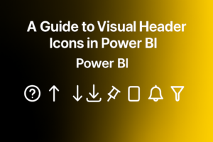
These are known as Power BI header icons.
Depending on the visual, report settings, and user permissions, header icons can help users drill into hierarchical data, review applied filters, open a visual in focus mode, personalize the visual, access help information, and use other available actions. Microsoft describes the visual header as the row of icons that appears at the top of a visual in reading mode and allows users to interact with it.
Understanding what these icons mean can make Power BI reports easier to navigate and help users get more value from each visual.
What are Power BI Header Icons?
Power BI header icons are interactive controls associated with an individual visual. They typically appear near the top of a chart, table, matrix, or other report visual when the visual is active or when a user hovers over it.
The exact icons shown can vary from one visual to another.
That is because not every visual supports the same actions. A chart containing a hierarchy may display drill controls, while another visual may show options for filters, focus mode, personalization, or additional actions.
Report creators can also control which icons are available. In Power BI’s formatting settings, individual header icons can be turned on or off instead of displaying every available option.
This means users should not expect every Power BI visual header to look the same.
Common Power BI Header Icons and What they Mean
Drill Up
The Drill Up icon lets users move back to a higher level in a hierarchy.
For instance, a visual may contain multiple levels, such as year, quarter, month, and day. After viewing a lower level, Drill Up allows the user to move back toward the broader level.
Microsoft notes that the Drill Up option becomes relevant after users have already moved down within a hierarchy.
Drill Down
The Drill Down icon activates drill mode.
When drill mode is enabled, selecting a data point can take the user deeper into that part of the hierarchy rather than simply highlighting it.
This is useful when a visual contains several levels of related data and the user wants to investigate one branch in more detail.
Go to the Next Level
Another drill-related action can move the entire visual to the next level of its hierarchy.
This is different from drilling into one selected data point. Instead, the visual changes so that users can review the next level across all relevant categories.
For reports with multiple levels of operational, geographic, product, or time-based data, this can make detailed exploration much easier.
Expand All Down One Level
The Expand All action allows users to move deeper into a hierarchy while retaining the context of the higher level.
This can be useful when users need to compare detailed values without losing sight of the category they belong to.
Together, these drill icons help users move between summary and detailed information without needing a separate visual for every level of analysis. Power BI can display several drill controls when the visual supports a hierarchy.
Filters Applied to the Visual
Power BI visuals can also provide users with information about the filters or slicers influencing what they see.
This matters because a chart may show only part of the underlying dataset due to report-level, page-level, visual-level, or slicer selections.
Being able to review filter context helps users understand why a visual is showing a particular result.
For decision-makers, this is especially useful when several filters are being used throughout an interactive dashboard. Instead of assuming that a number represents the entire dataset, users can check the context behind it.
Microsoft includes viewing applied filters and slicers among the actions available through visual headers.
Focus Mode
The Focus Mode option allows users to enlarge an individual visual so they can examine it more closely.
A dashboard may contain many charts on the same page. While this is useful for getting an overall view, smaller visuals can sometimes make detailed labels, categories, or values difficult to inspect.
Focus Mode lets the selected visual occupy more screen space without changing the underlying report design.
This is particularly helpful when working with:
- Detailed tables or matrices
- Charts containing many categories
- Visuals that require closer inspection
- Reports being viewed on smaller screens
Microsoft identifies opening a visual in focus mode as one of the common actions available from the visual header.
More Options
The More Options menu, usually represented by an ellipsis, provides access to additional actions available for a particular visual.
The options can vary based on the report, visual type, Power BI environment, and permissions.
Rather than displaying every possible function directly in the header, Power BI uses this menu to keep additional actions accessible without making the visual header unnecessarily crowded.
For report users, it is worth checking this menu because useful visual-level actions may be available there even when they are not shown as standalone header icons.
Personalize Visual
When report creators allow personalization, users can modify certain aspects of a visual according to their analytical needs.
The Personalize Visual functionality can allow users to adjust the fields or presentation of a visual without permanently changing the original report for everyone else.
Power BI allows report creators to enable or disable personalization for the whole report, individual pages, or individual visuals. For a specific visual, the setting is available under Format > General > Header icons > Icons.
This can be useful when different users need slightly different views of the same underlying data.
However, report designers should enable personalization thoughtfully. Too much flexibility can make a carefully structured report harder for less experienced users to navigate.
Help Tooltip
The Help Tooltip icon gives report creators a way to explain a visual directly within the report.
Users can select the icon to view short explanatory text or, depending on how it is configured, a dedicated report-page tooltip containing richer information.
This can be useful for explaining:
- What a KPI measures
- How a calculation should be interpreted
- Which filters affect a visual
- How users should interact with the chart
- What a less familiar metric means
Microsoft allows report creators to enable the Help Tooltip from General > Header icons and choose between text-based help or a report-page experience.
For complex BI dashboards, this can reduce confusion without adding large blocks of instructional text directly to the report page.
Copy Visual
In supported environments, Power BI can provide an option for users to copy a visual as an image.
This can be useful when a chart needs to be referenced in an email, presentation, or discussion outside the report.
However, report owners and administrators can control whether this capability is available. Microsoft provides settings for disabling the copy icon for a particular visual as well as broader tenant-level controls.
Because of these controls, users may see the Copy option in one report but not another.
Why do Power BI Visual Header Icons Differ Between Reports?
It is common for users to open two Power BI reports and notice that their visual header icons are different.
There are several reasons for this.
First, the available actions depend on the visual itself. Drill icons, for example, only appear when the visual has an appropriate hierarchy, and drilling is enabled.
Second, report creators can decide which header icons users should be able to access.
Third, some capabilities depend on report configuration, the Power BI environment, permissions, or organizational settings.
As a result, a missing header icon does not necessarily indicate a problem with the report.
How to Show or Hide Power BI Header Icons?
Report creators can control visual header icons from the formatting pane.
The general process is:
- Select the visual you want to configure.
- Open the Format visual pane.
- Go to General.
- Expand header icons.
- Turn the header icons on or off.
- Enable or disable individual icons based on what users need.
Power BI also provides formatting controls for visual header appearance, including background, border, icon colors, and transparency.
This gives report designers more control over both functionality and presentation.
Should You Show Every Header Icon?
Not necessarily.
A visual header should help users interact with a report, not make the interface more complicated.
If an icon does not support the purpose of a visual, hiding it can create a cleaner experience.
For example, a simple executive KPI may require fewer interaction options than a detailed operational chart that users are expected to explore.
A practical approach is to ask:
- Does the user need to drill into this visual?
- Will Focus Mode improve readability?
- Would filtering information prevent confusion?
- Does the visual need additional help or explanation?
- Should users be allowed to personalize or copy it?
Choosing header icons around the user’s actual reporting needs can make dashboards easier to understand and navigate.
Why does Understanding Header Icons Improve Power BI Report Usability?
Power BI header icons may occupy only a small part of the report interface, but they influence how easily users can explore and understand data.
When users recognize the available actions, they can move between summary and detailed views, verify filtering conditions, inspect individual visuals, and access additional report functionality without depending on the report creator for every question.
For report designers, header icons also provide a way to control the amount of interaction available within each visual.
The goal is not to display as many icons as possible. It is to give users the right controls at the right point in their analysis.
Conclusion
Power BI header icons provide quick access to many of the interactions that make reports more useful. From drilling through hierarchical data and checking filter context to opening Focus Mode, accessing help, personalizing visuals, and using additional options, each available icon can support a different part of the analysis process.
The exact Power BI visual header will vary depending on the visual, report settings, and permissions, so users may not see every icon in every report.
For report creators, understanding these controls makes it easier to design dashboards that are both interactive and easy to use. For report users, knowing what each icon does can make navigating Power BI reports faster and more intuitive.