


Origin Network
Visualize the geographic locations where shipment activity begins.

Curated dashboards plus predictive insights that recommend your next move
Insights, playbooks and product thinking from the Wise BI team.

Visualize where shipment activity begins and ends across your global logistics network.

The Problem
Shipment data may contain origin and destination information, but standard reports rarely show how those movements are distributed geographically across the logistics network.

Origin and destination records are often reviewed separately across operational reports.

Tables and spreadsheets do not clearly show where shipment activity is concentrated across global markets.

Emerging locations and changing cargo movements can be difficult to recognize without visual analysis.

Comparing port activity across periods, products, and companies requires extensive manual filtering.
Solution: Clear visibility into port shipment patterns.
Capability Overview
The Port Wise Volume Dashboard transforms shipment location data into an interactive global map, helping teams understand where cargo activity is generated and where it is delivered. Users can switch between origin and destination views and refine the analysis by year, month, company, and product.


Understand where shipment activity reaches across global markets.
 Display destination locations on a world mapCompare geographic delivery coverageIdentify active destination regions
Explore how different products move across the global network.
Filter port activity by productCompare geographic product coverageIdentify product-specific shipment patterns
See where shipments enter the logistics network.
Map active shipment originsIdentify clusters of origin activityCompare source-market coverage
Explore cargo movement from different business perspectives.
Filter activity by companyReview activity by year and monthSwitch between origin and destination viewsMetric Index
Explore global shipment coverage and geographic patterns from network summary to market-level detail.
Origin Network
Visualize the geographic locations where shipment activity begins.
Destination Network
Understand where cargo is delivered across international markets.
Product Coverage
Analyze how different logistics products are distributed geographically.
Company Activity
Compare shipment coverage across companies within the business.
Time-Based Analysis
Review port activity by selected year and month.
Global Footprint
Evaluate the overall geographic reach of the logistics network.
Who Benefits from this Dashboard?

Understand geographic shipment coverage and identify active logistics markets.

View origin and destination activity without reviewing multiple operational reports.

Recognize market presence and uncover potential areas for business development.

Gain a high-level view of the organization's global logistics footprint.
The Port Wise Volume Dashboard gives logistics teams a clearer understanding of where shipment activity is occurring across the world. By converting location data into an interactive map, the dashboard supports faster geographic analysis and more informed network decisions.
Key Outcomes:
 Visualize shipment origins across the global network.Switch instantly between the origin and the destination activity.Identify geographic concentrations in cargo movement.Compare shipment coverage by company.Explore product activity across different markets.Analyze changes by year and month.Understand the global footprint of your logistics network.Use WiseAI to investigate emerging shipment patterns and geographic trends through natural-language questions.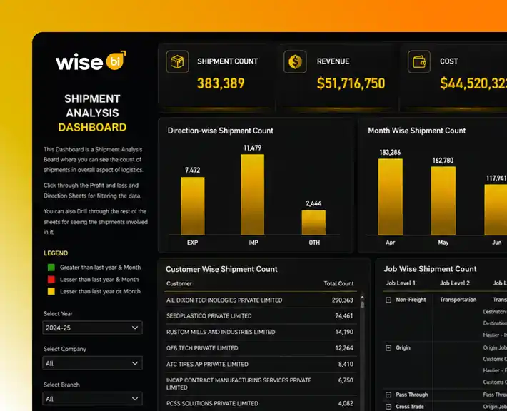
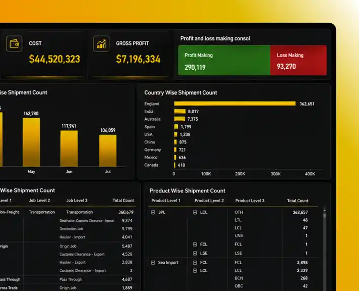
"Every shipment location reveals another part of your global logistics network."
Provides a clear visual representation of the business's global logistics footprint.Supports focused exploration by year, month, company, and product.Presents origin and destination activity through an interactive global map.Makes complex global shipment activity easier to interpret across business teams.Enables teams to switch between source and delivery perspectives instantly.Helps users recognize geographic shipment patterns without manual location analysis.Pre-mapped with CargoWise shipment data for consistent geographic reporting.WiseAI helps users investigate network coverage, location trends, and changing cargo patterns.Blogs, newsletters and case studies on CargoWise Port Wise Volume Analysis Dashboard.
 Blog
Blog
Nearly 80% of global trade volume passes through seaports, but most logistics teams still make decisions based on delayed reports or manual spreadsheets. This…
 Blog
Blog
Revenue is recorded when the invoice is raised, but cash flow improves only when the customer pays. A completed freight job does not mean…
 Blog
Blog
For a freight forwarder, completing a shipment and issuing an invoice are only part of the financial cycle. The job truly turns into cash…
Select the Origin view to display shipment starting locations across the interactive global map.
Switch to the destination view to understand where cargo is delivered across different countries and regions.
Yes. Product filters help you explore how specific logistics products are distributed across origin and destination markets.
Use the year and month filters to compare shipment coverage across different reporting periods.
WiseAI helps users investigate shipment concentrations, compare geographic activity, identify changing location patterns, and explore network coverage using natural-language questions.