



Ocean freight performance can change quickly across trade lanes, customers, ports, and reporting periods. Shipment activity may increase while costs rise even faster. A high-volume route may take longer than expected. Another trade lane may move less cargo but deliver more consistent transit performance.
When these changes are spread across CargoWise reports, spreadsheets, and monthly summaries, executives may struggle to understand what is actually going on.
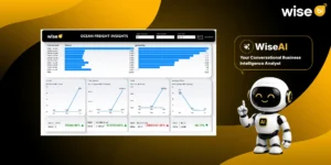
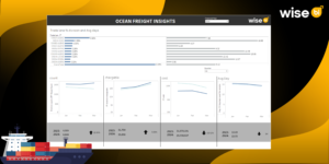
A CargoWise Ocean Freight Insights dashboard brings ocean freight data into one visual reporting environment. It helps freight forwarders compare shipment count, chargeable volume, cost, average transit days, and trade-lane performance across selected companies, quarters, and years.
Instead of reviewing each metric separately, your operations, finance, commercial, and leadership teams can see how ocean freight activity, cost, volume, and transit performance are changing together.
What is a CargoWise Ocean Freight Insights Dashboard?
A CargoWise Ocean Freight Insights Dashboard is a business intelligence solution that converts CargoWise ocean freight data into interactive charts, comparisons, filters, and performance views.
The dashboard shown in the uploaded file tracks:
- Ocean freight shipment count
- Chargeable volume in cubic metres
- Ocean freight cost
- Average transit days
- Trade-lane volume percentage
- Average days by trade lane
- Current-year and previous-year performance
- Monthly trends
- Performance by company, quarter, and year
This structure enables freight forwarders to move beyond basic reporting.
Ocean Freight Performance Difficult to Evaluate with Standard CargoWise Reports
Ocean freight performance is determined by several interrelated factors.
A trade lane may have high volume but a longer average transit time. Shipment count may rise without a corresponding increase in chargeable volume. Carrier rates, port charges, handling expenses, and routing changes can all cause costs to rise.
When these metrics are examined separately with CargoWise reports, the company may overlook the connection between them.
For example:
- A branch may handle more ocean freight shipments but move less chargeable volume
- A trade lane may contribute strong volume but take longer than other routes
- Costs may rise faster than shipment activity
- Average transit days may improve overall while one important trade lane continues to underperform
- Current-year activity may appear strong until it is compared with the previous year
The BI dashboard integrates CargoWise ocean freight data and consolidates these relationships into a single view, allowing your team to look into changes more thoroughly.
Track Ocean Freight Shipment Count
The shipment count indicates how many ocean freight movements were processed during the specified time period.
This KPI helps managers understand activity levels and compare performance across months, quarters, companies, and years.
However, shipment counts should not be used alone.
A higher volume of shipments may necessitate more documentation, customer communication, carrier coordination, and operational workload. However, those shipments may not always result in a corresponding increase in cargo volume.
By comparing shipment count to chargeable volume, your team can determine whether the growth is due to more jobs, larger cargo movements, or both. This improves staffing, workload planning, and visibility of ocean freight performance.
Compare Chargeable Volume with Shipment Activity
The dashboard measures chargeable ocean freight volume in cubic meters.
This helps freight forwarders understand how much cargo is handled rather than how many jobs are processed.
Comparing shipment count and chargeable volume helps answer practical questions:
- Are we processing more shipments or larger shipments?
- Is cargo demand increasing on a specific route?
- Does current carrier capacity match the volume?
- Are operational resources aligned with the amount of cargo being moved?
- Is a branch handling more jobs without meaningful volume growth?
These insights make volume planning more accurate.
Monitor Ocean Freight Cost Trends
Ocean freight cost is another core metric in the BI dashboard.
The dashboard compares cost by month and shows current-year performance against the previous year.
This enables finance and commercial teams to determine whether costs are rising, falling, or changing faster than shipment consolidation performance activity.
A cost increase may be linked to:
- Higher carrier rates
- Port and terminal charges
- Additional handling
- Route changes
- Lower capacity utilisation
- More expensive trade lanes
- Changes in cargo mix
Cost analysis is more useful when combined with shipment count and chargeable volume.
If costs increase while volume remains stable, management may need to look into carrier pricing or route efficiency. If both costs and volumes rise, the company should consider whether the increase is proportionate.
The BI dashboard simplifies these comparisons during pricing reviews, carrier discussions, and budget planning.
Measure Average Ocean Freight Transit Days
Average days show how long ocean freight movements take during the selected period.
The dashboard compares monthly average days and current-year performance with the previous year.
This metric is important because transit performance directly affects customer expectations and operational planning.
A rise in average days may indicate:
- Slower carrier performance
- Port-wise volume performance congestion
- Route changes
- Transshipment delays
- Longer trade-lane movement
- Changes in shipment mix
A lower average may indicate better routing or carrier performance, but management should still evaluate individual trade lanes. An overall average can obscure route-level issues.
Identify Slow and High-Volume Trade Lanes
The trade-lane view combines volume percentage with average days.
This is one of the dashboard’s most useful features because it allows managers to understand the importance and performance of each route.
A high-volume trade lane with longer transit times may necessitate immediate attention because delays on that route could impact more customers and cargo.
A low-volume trade lane with poor transit performance may still require review, but the operational and customer impact may be minimal.
This comparison enables your team to ask:
- Which trade lanes carry the highest share of volume?
- Which routes take the longest?
- Are high-volume routes meeting expected transit times?
- Which lanes may need a carrier or routing review?
- Where should customer expectations be managed more carefully?
Trade-lane analysis helps improve carrier selection, route planning, customer communication, and service evaluation.
Compare Current-Year and Previous-Year Performance
A single period does not provide enough context.
The dashboard compares current-year and previous-year results for shipment count, chargeable volume, cost, and average days.
This helps leadership understand whether the business is improving or declining over time.
For example:
- Shipment count may be higher than last year.
- Chargeable volume may be growing faster than count.
- Costs may have increased sharply.
- Average transit days may have improved.
These changes need to be reviewed together.
Higher volume is positive only when the operational and cost impact remains manageable. Lower average transit days are valuable only when they are consistent across key trade lanes.
Year-over-year comparison gives management a stronger basis for planning and performance discussions.
Filter Ocean Freight Performance More Precisely
Users can filter the BI dashboard by company, quarter, and year.
This helps different decision-makers focus on the results relevant to them.
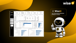
These filters help determine whether a change is company-wide, seasonal, or limited to a single reporting period. These filters help determine whether a change is company-wide, seasonal, or limited to a single reporting period. Additionally, our Conversational BI is useful. Instead of manually applying filters in dashboards, users can ask a question in plain English and receive the following:
- Instant, context-aware responses
- Read-only data analysis and permission-based access
- Automatically generated charts and clear tables and comparisons
- Relevant explanations for business trends
- Faster insights without using multiple filters
- Follow-up analysis using natural conversation
- Improved accessibility for non-technical business users
CargoWise Ocean Freight Insights Dashboard Benefits Freight Forwarders
WiseBI’s CargoWise Ocean Freight Insights Dashboard assists freight forwarders in transforming reporting data into actionable decisions.
Operations teams can monitor shipment activity, average days, and slow trade lanes.
Finance teams can compare ocean freight costs across periods.
Commercial teams can review high-volume routes and identify where pricing or carrier discussions may be required.
Leadership can compare current-year and previous-year performance and understand whether volume growth is creating additional cost or operational pressure.
The dashboard gives these teams a shared view instead of separate spreadsheets and interpretations.
Conclusion
Ocean freight performance cannot be understood through shipment count alone. Freight forwarders also need visibility into chargeable volume, cost, transit days, trade-lane volume share, and year-over-year changes.
A CargoWise Ocean Freight Insights Dashboard brings these metrics together and helps your team identify where activity is growing, where costs are increasing, which trade lanes are taking longer, and whether current performance is stronger than it was the previous year.
Book a free demo with WiseBI to see how the CargoWise Ocean Freight Insights Dashboard can help your team monitor trade-lane performance, control ocean freight costs, and improve planning with clearer data.